I’ve kept track of the time that I spend on different forms of transportation: trains, buses, boats, and planes during my trips.
And here are some nice figures showing that data, Enjoy!

The bar graphs gives you a nice overview of how much time I've spent in transit.
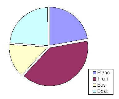
I put in a pie chart cause really, who doesn't like a pie chart, even though they are stupid because they are qualitative. Is the blue one bigger than the green one? Is the yellow one half the red one? The bar graph knows!

This one is my favorite. It shows how much travelling I have done and when, but also how my travel mode habits have changed. While its not exactly what I wanted, its pretty close.
Peace out!
No comments:
Post a Comment